Planting the Color Wheel Part 3: Triadic Colors
Are you ready to turn your garden into a joyful explosion of color, this time using colors in groups of three?
If you want to color your garden HAPPY with the bright and bold… Imagine vibrant reds that spark passion, bright yellows that radiate sunshine, and cool blues that whisper calm and ground the palette… all dancing together in your flower bed.
This bold, high-energy palette isn’t just eye-catching… It invites bees, butterflies, and big smiles to your yard. You’ll often see these colors together in children’s gardens, buzzing pollinator patches, and the hottest summer plantings. Welcome to the Primary Colors garden.
If you’re craving the more unexpected, artistic, and nurturing combo… Meet the trio of orange, green, and purple- a color combo that is equal parts drama, balance, and whimsy.
Orange brings the energy, purple adds a regal touch, and green grounds it all in lush calm. Together, they create a contrast that is striking, wild, and wonderfully coordinated. You’ll see this fearless palette pop up in edible gardens, modern landscape designs, and anywhere creativity blooms. Welcome to the Secondary Colors Garden.
Want to bring one or both of these combinations to your garden? Let’s dig in…
In this creative approach to planting the color wheel, a key in each combination is to pick a dominant color that is bright and eye-catching, and use the other two as accent colors. It’s clean and cohesive this way, and acts as a visual anchor for your eye! If there are too many bold colors, it can feel overwhelming. For example, yellow makes a great builder color! Since yellow is the brightest and most eye-catching of the three primary colors, it’s an ideal dominant color for this garden. You can then accent the yellow with smaller sections of reds and blues. Here’s some design tips for each combination, and more favorite flowers in each color! Combine both annuals and perennials for the best variety. Let’s dive into each combo!
The Classic-but-Bold Primariesd
Bold, playful, and with high energy, the passionate reds, sunny yellows, and calming blues come together to transform your outdoor space. This garden color scheme practically throws a party in your backyard! This classic combo never fails to shine.
Dominant Color: For primary’s dominant, choosing yellow or blue is ideal. Red is visually intense, and also advances visually (meaning it appears closer), so it may make a garden feel smaller. Using yellow or blue as dominant tends to open up space visually and keep it feeling lighter and balanced.
Why Plant Primaries?
Attention-Grabbing: They’re perfect for focal points, entrances, or areas that need drawing attention to. They are not muted or subtle- they stand out boldly.
Artistically Classic: Timeless and the color theory fundamentals, it’s the trio that artists use to build every other hue.
Playful and Cheerful: These colors are full of joy, nostalgia, and energy.
Strong Contrast: Not only are they equally spaced on the color wheel but they’re bold against each other.
Now, let’s talk about specific flowers.
Red draws attention, yellow cheers, and blue calms.
Red: The Bold Showstopper
Mood: Brings boldness, passion, and power- red flowers command attention.
Effect: Creates drama and excitement. It’s a color of movement and heat, making a space feel energized.
Use it For:
- Drawing the eye to focal points
- Adding heat to cool or shady areas
- Creating bold, tropical, or romantic themes.
- Attracting pollinators- especially hummingbirds and butterflies.
Spring Bloomers
- Geraniums→ Bright staples that keep on blooming! The ultimate classic red annual.
- Tulips→ A classic spring bulb, should be planted in fall for early spring blooms.
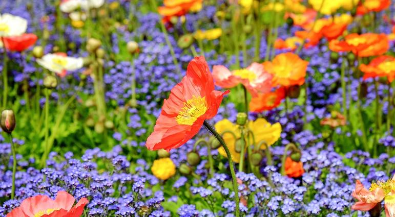
- Poppies→ Papery petals that dance in the breeze. Pair with yellow daffodils and tulips, and blue hyacinths and forget-me-nots.
- Azaleas→ Bright shrubs that light up any shady spot!
☀️Summer Bloomers
- Salvia→ Has a strong summer color and show off spiked tubular flowers.
- Bee Balm→ Bold and tall, these rich reds are mid to late bloomers!
- Zinnias→ Easy, vibrant, and long-lasting.
- Roses→ Many are long bloomers from spring to fall!
Yellow: The Bright Optimist
Mood: Brings warmth, cheer, and a friendly glow; the smiling sunshine.
Effect: Uplifts and creates a cheery environment.
Use it For:
- Lighting up shaded spots or darker areas of the garden.
- Pairing with yellow for a high-contrast.
- Welcoming front entryways and creating movement.
Spring Bloomers
- Daffodils→ The ultimate symbol of spring- Classic spring bulb with many varieties.
- Tulips→ Bright and formal looking.
- Forsythia (shrub) → An early spring bloom, practically exploding with yellow color! The bright yellow flowers are on bare stems.
- Primroses→ Low-growing, and therefore ideal for borders and containers.
☀️Summer Bloomers
- Coreopsis→ Happy-faced and drought-tolerant. A long bloomer!
- Black-Eyed Susan→ A summer meadow favorite! Sports a classic daisy-like shape and is hardy.
- Yarrow→ Drought-tolerant, feathery foliage, gives a ‘dusty desert’ vibe and rustic charm.
- Sunflowers→ Tall and dramatic! These make great focal points.
- Marigolds→ Easy to grow from seed and make great border and container flowers.
- Goldenrod→ Late summer gold that’s bee and butterfly approved!
Blue: The Calm Companion
Mood: Calm, contrast, and has visual intrigue. It balances out the warmth of the red and yellow. It’s the cool, collected thinker.
Effect: Coolness, visual depth, and has a receding effect (makes spaces feel larger)
Use it for:
- Balancing hot colors
- Creating a tranquil, meditative zone
- Making small gardens feel bigger
- Cool-toned designs: Combining with whites, silvers, and cool greens
Spring Bloomers
- Grape Hyacinths→ Tiny and fragrant with intense blue! It makes a classic spring combo when paired with red tulips and yellow daffodils.
- Siberian Squill→ A burst of brilliant blue in the early spring!
- Brunnera → Dainty sky-blue spring flowers above heart-shaped leaves—like forget-me-nots, but well-behaved.
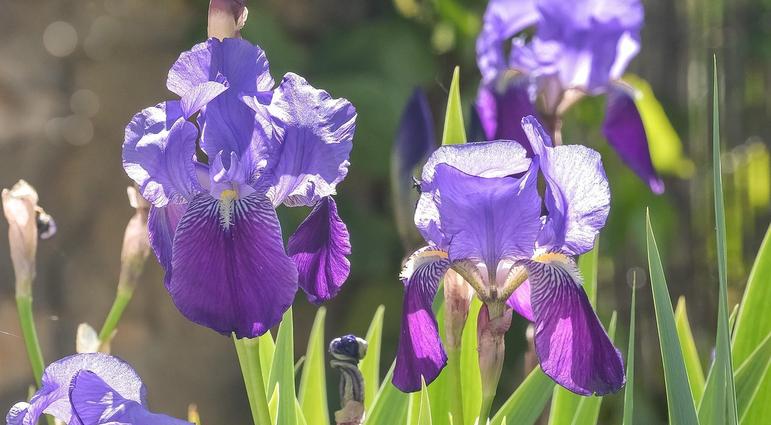
- Iris→ Stately and elegant, some with dramatic ruffles.
- Bluebells→ A woodland carpet of cool color!
- Periwinkle→ Low-growing evergreen groundcover with lavender-blue flowers.
☀️Summer Bloomers
- Salvia→ A pollinator favorite! Come in a variety of colors, but often a deep purple-blue.
- Cornflower (Bachelor’s Button) → Old-fashioned charm in a vivid blue!
- Lobelia→ Low-growing bursts of vivid blue (great for borders and containers)
- Delphinium→ Towering spikes in true blues and purples.
- Balloon Flower→ These buds inflate (hence the name) before opening up to bloom into star-shaped flowers!
- Veronica→ Sport compact spikes in blue and purple tones; an easy-care perennial.
- Blue Flax→ Airy, sky-blue flowers on slender stems; drought tolerant.
Primaries Design Tips:
- Use red more sparingly for maximum effect. Too much can feel overwhelming, but in the right dose, it’s pure fire.
- Yellow acts as a highlighter- use it to draw attention to pathways, focal points, entryways, or plants you want ‘showcased.’
- Mix blues with silver, white, or green foliage for a cool-toned, relaxed palette.
- When planting primaries in the spring→ yellow daffodils + blue grape hyacinths + red tulips= a contrasting, classic pop!
- When planting yellows in the summer, place tall sunflowers in the back, coreopsis and marigolds in the middle, and creeping yellow lantana in the front.
The Artistic & Harmonious Secondaries
Sometimes the primary colors seem like they get all the attention- they are the boldest, after all! But it’s the secondary shades that can bring the real magic! They’re the creative twist, the unexpected harmony of the garden. These three colors are nature-inspired and versatile, often feeling more sophisticated and soothing than their primary counterparts. And they’re not just beautiful… They're functional, too! Orange and purple blooms are pollinator magnets. Here we will dive deeper into how to get planting with the secondaries.
Why Use Secondaries?
Harmonious and Blended: Since these colors are often found in nature, they blend easily into the landscape.
Elegant and Calming: Unlike the boldness of primary colors, secondary tones can create a serene look.
Seasonally Flexible: These colors blend with any season, really! Many plants with these colors bloom throughout the year.
The orange sizzles, the green soothes, and the purple stuns.
Orange: The Warm Inviter
Mood: Welcoming, playful, and full of energy.
Effect: Orange combines the passion of red and the cheer of yellow. It’s warm, bold and radiates joy without being too overwhelming.
Use it To:
- Create a sunny and friendly atmosphere.
- Add vibrancy to muted or spaces heavy with green.
- Pair with cool colors like purples or blues for stunning contrast.
Spring Bloomers
- Orange Tulips→ like the colors of a sunset, they’re a bold and easy spring color
- Poppies→ A striking orange flower, classic and full of spirit.
☀️Summer Bloomers
- Daylilies → Tough and colorful with countless orange varieties!
- Echinacea→ Citrusy and warm twists on the native coneflower!
- Marigolds→ Nonstop bloomers, super cheerful and pest-deterring.
- Zinnias→ Long-blooming, heat-loving, and great for cutting.
Green: The Great Unifier
Mood: Calm, grounding, and refreshing.
Effect: Green is the most abundant, but also the most restful. It ties everything together and gives the eye a place to rest. Though often overlooked as a flower color, the green foliage adds plenty of texture and rhythm!
Use it To:
- Soften bold colors and cool down hot palettes
- Add structure, texture, and balance
- Create a foliage-focused garden
Spring Standouts
- Hydrangea ‘Limelight’ → Pale green flower heads; starts blooming in late spring.
- Hosta→ Variegated and green varieties bring texture and pops of green! Shade-loving.
- Ferns→ Maidenhair and Ostrich are some standout varieties; create an ethereal, forestry feel.
- Green Heleborres→ Nodding green flowers in late winter to early spring
☀️Summer Standouts
- Bells of Ireland→ Unique vertical spikes of green “bells.”
- Sedum ‘Autumn Joy’ → Green, but turn pink in late summer. Adds aIO unique, desert texture and feel!
- Ornamental Grasses→ Lush and structured, these add movement to your garden.
- Coleus→ Tropical-looking foliage; many hues of greens with pops of bright colors!
- Green Zinnias→ Unusual and eye-catching in cut flower beds!
Purple: The Regal Romantic
Mood: Mysterious, Elegant, Soothing
Effect: Purple adds depth and richness to any planting scheme. It balances warm and cool colors and is luxurious or whimsical- depending on how it’s used!
Use it To:
- Bring a sense of sophistication
- Contrast with oranges for drama
- Cool down hot colors
Spring Bloomers
- Iris→ Bold, architectural, and make a statement!
- Allium→ Unique with their globe-shaped blooms in bold purple hues (late spring)!
- Lilac→ Heavily scented and bursting with color!
- Clematis→ A classic climber! Many have mauve, lavender, or violet flowers.
☀️Summer Bloomers
- Lavender→ Iconic scent and texture!
- Liatris→ Vertical spikes with fuzzy, bright purple flowers!
- Petunias→ Bedding annuals with a big impact!
- Russian Sage→ Whispy silver stems with lavender-colored flowers. Great if you want a more ethereal, softer purple.
- Purple Coneflower→ A classic, native icon! Pollinators love it.
- Catmint→ Long-blooming, pollinator friendly, and smells so yummy!
Secondaries Design Tips:
- Use orange to draw the eye across the entire garden: It pops in sun and also partial shade.
- When planting greens, combine both variegated and bold-textured greens (hosta, ferns, ornamental grasses). This will heighten visual interest!
- When considering purples, remember that dark purples recede in the landscape- making them perfect for mystery or depth. Pale purples (like lavender) feel ethereal and pair beautifully with soft greens and whites.
- Combining Secondary Colors:
- Orange + Green= Warm & Earthy, especially in fall palettes
- Orange + Purple= High Contrast & Drama
- Green + Purple= Soft & Balanced; Very Calming
As you can see, color in the garden tells a story. Each color, and each combination, brings an impactful personality in its own way!
The primary colors- red, yellow, and blue- offer bold clarity and joyful impact. They’re the heartbeat of cheerful beds, playful borders, and timeless designs that are open and full of life.
The secondary colors- orange, green, and purple- bring nuance, contrast, and creative expression. This palette leans into the unexpected- offering a garden that feels artistic, grounded, and rich with mood.
Whether you lean into the classic charm of the primaries or the creative expressiveness of the secondaries (or both!)- designing with color is all about making your own garden express itself and set a tone! I hope you have enjoyed this guide and that it’s been helpful to you for shaping the personality of your garden. Let your personal style shine through these fantastic color combinations!